
SPACEPUNK

Crashlanded on an alien planet, you have nothing but the power of scavenged spaceship wreckage to make it through an onslaught of extraterrestrial bugs - it's just a shame that all that cool tech keeps getting in the way. Will you remain blissfully ignorant of all the pointless information beamed straight into your visor, or will you perish by walking into a worm you couldn't see behind all the smoke?
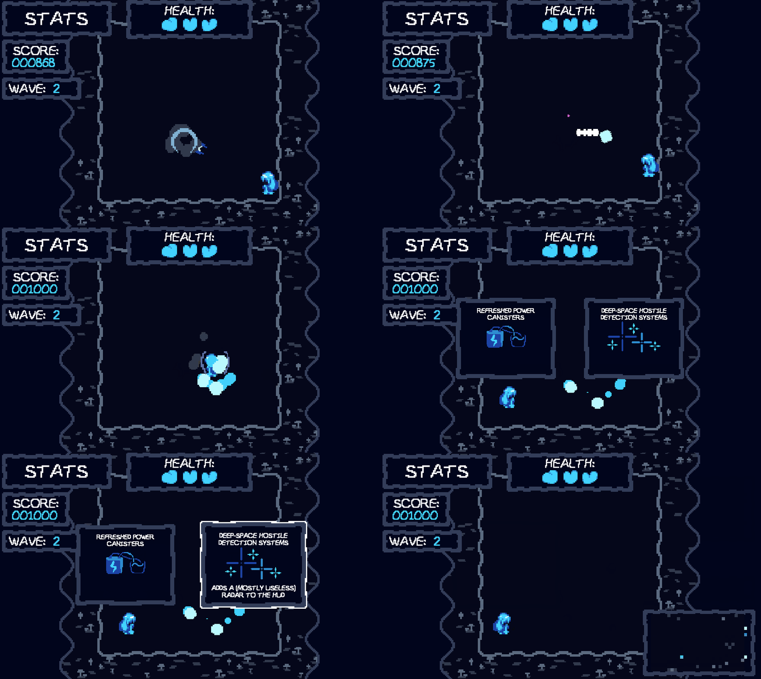
To play the game, you fight off a horde of aliens, collecting powerups from them to grow more powerful. At the end of every wave, you also scavenge wreckage from your ship to gain more information about what you're doing. But beware! There's such a thing as too much information, and after a few dozen rounds of scavenging or so it might be difficult to actually see what you're doing. Best of luck dealing with that!
The controls, last time I checked:
- WASD/Arrow keys to move around, hold down either the left or right mouse button to shoot
- Click to advance the starting comic and to choose your additional effect after each wave ends
- Point your mouse at the enemies and click at them to shoot them
- Move over the arrow powerups to gain extra damage
- Survive as long as possible to maximise score

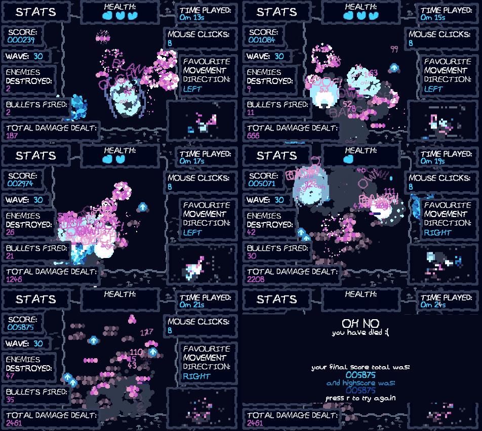
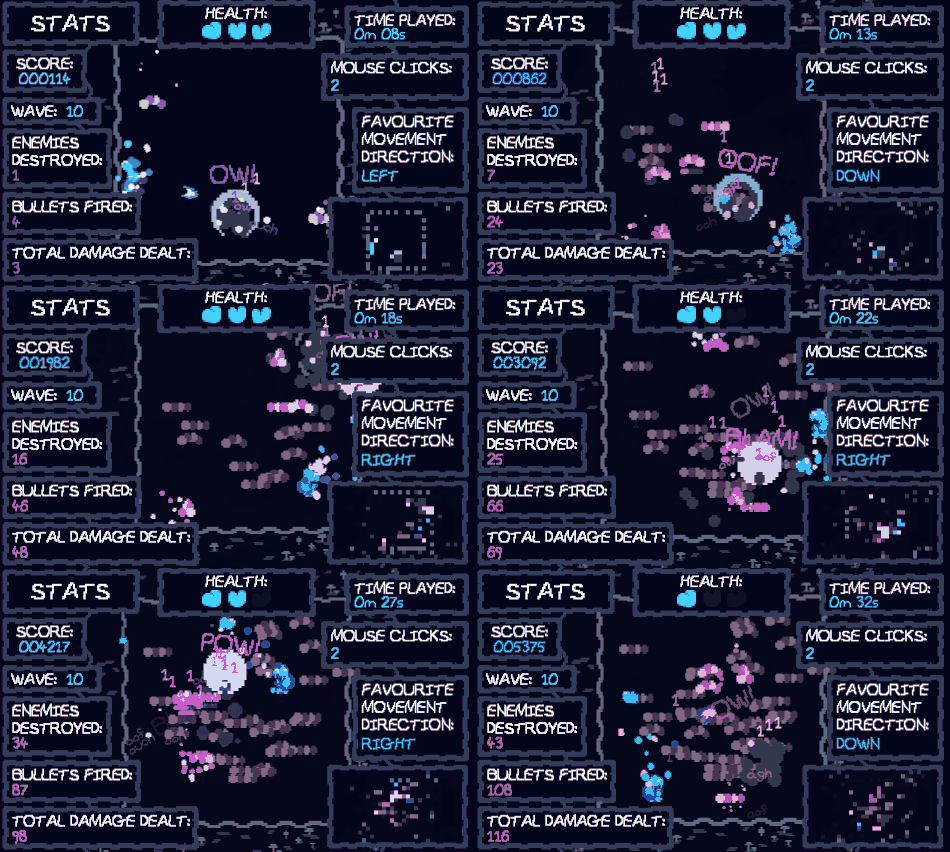
I'm happy with the gamefeel, the juice, the feedback, the whatever it is in this game that makes moving around and shooting things fun - that's probably the main thing I learned from development, that giving the player feedback is fun! I don't really play too much with vfx when making games, I just sort of stick to what I know, so to try and push the boundaries to the extreme in this game was interesting; I never realised the enemies going "ouch" or "oof" when you hit them added so much to combat, for example. It was also surprisingly difficult to get the game to be completely unreadable under all the effects, so now I know it's kind of hard to overdo juice in games! I promise not to abuse this power. One thing I think I could've done better, though, was the gameplay itself, because behind all the particle effects there's not really much going on, and I've kind of always though my games could do with more interesting gameplay, so it's a shame that this game doesn't do much new or interesting with that. It's particularly a shame because I keep making shooter games for game jams, since they're easy to make, but they're not really interesting to develop either. There's always next time for interesting ideas, though, and at least this is one more shooter game out of my system. Another little thing that irks me is that the theme isn't the clearest in the game - the original idea was that more and more stats get forced onto the HUD until it's practically impossible to see or play the game, hence the "ignorance of stats is blissful, because you can't play the game otherwise" idea. Unfortunately, coming up with enough stats to put on screen was surprisingly hard, so I went more with the massive amount of particle effects idea instead, which is a bit more distant from the theme. It also means that if you play your cards right, you can still clearly see the gameplay even after a dozen or so upgrades in, so the theme's lost a bit there as well. Still, I hope the theme came across well enough despite that.
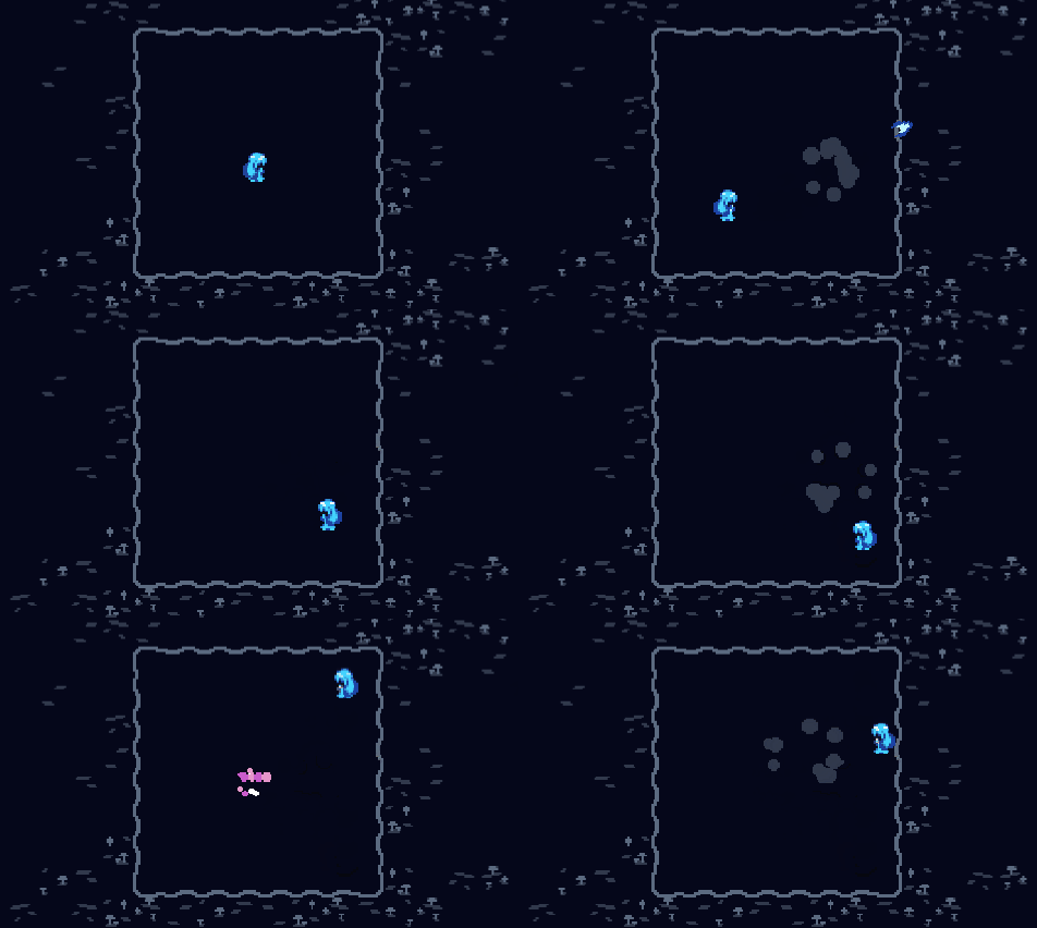
One thing I am happy about, though, is the artstyle of the game - less so the actual sprites, since they're not too interesting on their own and can be kind of difficult to read, but how the sprites come together - the whole aesthetic of the game. The blue/pink/black colour palette looks pretty appealing to me, the UI fits with the game and looks surprisingly clean considering it's supposed to distract you, and when all the effects are stacked I think the game looks good in the same way a Jackson Pollock painting looks good; I can't really tell what's going on, but it's pretty. The outline-less sprites also work well; they're readable thanks to the colours, and I liked that idea enough to bring it to the thumbnail too. Of course, all of that I said above is subjective, but I still do like watching the gifs I made of the game over and over despite that, so at least I like it. The sound design was fun to do as well, particularly since I got to both mess around in Chiptone and somehow produce actually good sounds as a result. I now love the white noise vibrato, and the harmonics, and I'm glad the development of the game could show me the black magic of bitcrushing and ring mods. One minor thing that I'm proud of is the music stopping and starting when you die and reload - I don't know why that actually seems like such a neat little feature to me, but I think it's cool anyways.
The last thing I'll mention, then, is kind of meta; I'm pretty happy about how the game page looks as well. I know I write a ridiculous amount for these, and I'm aware shorter game pages are generally better, but it's also pretty damn fun to talk about my own creation at length, so I hope you can forgive me for that. I wish more people would take it further with page design, and I wish I would too (I'll get custom CSS someday!), because it's pretty fun to take the experience of the game beyond the little Unity viewport and outside onto the webpage and the internet as a whole. Plus, I like hearing what other people have to say about their games when they write post mortems like these, I like to know why people designed the game in the ways they did. I also understand, though, that most people don't really want to write or read three paragraphs of their thoughts on every game they make, so I'll let it slide. If you somehow made it through these three paragraphs that I've written, then, congrats! I hope my rambling was useful or interesting. And I hope you had as much fun playing the game as I did making it! What's your highscore? I'd love to know!
| Status | Released |
| Platforms | HTML5 |
| Rating | Rated 4.5 out of 5 stars (12 total ratings) |
| Author | Cakestorm |
| Genre | Shooter |
| Made with | Unity, Audacity, GraphicsGale, ChipTone |
| Tags | 2D, Aliens, Pixel Art, Retro, Short, Singleplayer, Space, Top-Down |
| Code license | Unlicense |
| Asset license | Creative Commons Zero v1.0 Universal |
| Average session | A few minutes |
| Languages | English |
| Inputs | Keyboard, Mouse |






Comments
Log in with itch.io to leave a comment.
Love the game with its atmosphere, but since I'm using mouse pad, aiming my shooting could be hard, so I chose to stay on a corner and aiming the enemies on the center.
Wish I could heal so I could see more of the options. Got Damage Numbers on my first run, and tons of Companions on my second. Either I didn't notice the upgrades until Round 3 or so in my first run, or something, those were so useful, allowing me to anticipate when I could stop shooting at an enemy and retarget. Got A+ on Wave 9 in my second run.
Good & fun to play! Nice concept and mechanics. Loved it!
It's got nice gamefeel and it's very polished but I can't help but notice that the gameplay feels like a recycled version of your Interstitial Hyperdreaming game? Or at least runs along a very similar path stylistically to it and doesn't feel like it directly relates to the theme of ignorance is bliss? But that might just be me, overall really fun game in a nice package.
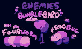
The mechanics work well and the very concept of what makes you worse from an overabundance of information perfectly beats the topic. However, the gameplay itself is monotonous, and no matter how much information they give you, you still monotonously shoot 3 types of enemies that differ only in hp and speed, which makes the game quickly boring. The graphics are good, but there are few colors, which, as for me, is a small minus. Average 8/10.
Very good i love this game, graphics musics, very nice play this, success for you project